Friday 19 October 2012

Digipak & Poster - Charlie


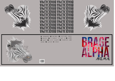
Here i have taken into consideration our theme 'disjuncture' and incorporated that into my digipak and poster, we are using animal masks in our video so this is why i have used an outline of a zebra head.
The colours are pretty plain and this is because of our colour scheme and too many colours would ruin the disjuncture feel.

Daft Digipack and Poster

Here are images of my completed 1st draft Digipack and Poster. All work done was using Adobe Photoshop 9.0.

Analysis of posters - charlie

Monday 8 October 2012

Album name - Charlie


Here i am focusing just on the album name - ANIMAL.

i would like to gather feedback on which style of lettering/font to use as i am very pleased with the BRAGE ALPHA on the cover.

Intrinsic Feedback of Digipak Design

looking back at this design of my last post I would make a change to the text of 'ANIMAL' by changing it to a thinner type face but using the same font still. This could easily be done on photoshop if I was to expand on that design.

Sunday 7 October 2012

CD Cover Idea - Michael

THE TRIANGULAR DESIGN IS TAKEN FROM A CLOTHING DESIGNER'S LOGO, THEREOFORE I WILL NEED TO DESIGN MY OWN IF I WERE TO VENTURE DOWN THIS LINE OF DESIGN. This is a design that I came up with when drafting some ideas on photoshop. The design and colour scheme evidently go against what my previous posts say how my digipak will look. However I do feel this is a style that may be useful for Brage Aplha's cover as the genre of music does not focus on star image therefore the lack of image is not a huge problem ii also fits to the conventions of a disjuncture if I were to choose to go with that kind of style. One final thing that I tried to do with the triangle design was to colour it with a leopard print design to fir the 'animal' title.

Thursday 4 October 2012

Digipak Analysis - Charlie

inspiration for inside pages of digipak

For the inside pages of the digipak I intend to include plenty of images of the star, within these images I will try to acheive a continuation of the 'deluded' mindset of Brage Alpha. One way this could be layed out is shown below.

example CD cover

Here I have found a CD cover of one of Beyonce's albums, this is quite obviously a very different genre and targets very different people to mine. However the use of black and white which creates great clarity and a sense of purity which is a result that I also hope to acheive. The reason for which I want to create this clear emotion portrayal is so that the audience can get an insight to who Brage Alpha actually is as this is his debut CD. What I would not make use of from this example however is the graphology in the writing, Beyonce has used a font that shows a regal and glamorous personality, this is a clear contrast to my artist. Instead I would choose a more simple font that does not take away from the message of the image being in a dark place.

plan for digipak - Michael

I am now in the process of planning how my digipak and poster will look for my end product. At this stage my thoughts are of using black and white throughout with the addition of a primary colour, probaly red. I intend to acheive clarity of emotions through facial expression and portray a contextual message of Brage Alpha to represent the feeling of the video. An example of this colour scheme and a CD cover that shows a raw emotional image is U2's War.

Wednesday 3 October 2012

Digipak Analysis


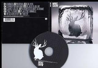
This is Miike Snow's recent CD digipak for his album, as you can see its quite plain and doesn't have masses of colour or anything like that. He has his very iconic rabbit with antlers at his front cover photo and as an image on the CD.

I want to create a digipak that is simple but very affective like this one with images but plain in colours.

Tuesday 2 October 2012

Digipak Draft


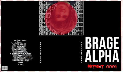
This is me playing around on photo shop trying to create a digipak for my artists new album. Obviously its not finished but i wanted to show my progression from the start to finish.
I have gone for the black and white theme to stick with the disjuncture theme of our video and the white more so for purity, the way he thinks hes free and not crazy.
My finished draft digipak will be on soon!

Digipak


I found this template for a 6 panel CD digipak with the measurements. It contains the front part of the digipak and all the inside panels plus the shape in which the cd sits. I plan to use this to create the shape and design for my digipak 

Monday 1 October 2012

Our Lead Artist

The reason for which we have chosen this person is prodominantly due to his look and style. The large and messy hairstyle he wears suits the persona of someone being delluded and confused down to a tee. When filming his facial hair style will be prominant in his look also, this is a trate of style which will appeal to our target audience we feel. his personality is out going and confident, this gives us more assurance that when it comes to filming he will not be camera shy or nervous when lip sinking.
The other two people in the video have been chosen on the basis that again they will be comfortable in front of camera and be able to understand the things required of them in positins and movements.