Friday 21 December 2012
research for my evaluation question 3
My plan for this question is to produce a radio interview media piece. the idea is to have studio guests who are fans (audience) who talk about the video and can even put questions to Brage Alpha himself. This will be a good way of displaying my feedback as I will be able to structure the interview so that all topics such as ancillary products and video. I plan to cast back to feedback from early pieces of work by asking the audience to explain how they like how the product has evolved and whether they feel that any changes should have been made.
Here I have looked at transcripts from top radio stations such as Radio 1 to learn how to structure a successfull intgerview.
Please follow the link to see this.
http://u2_interviews.tripod.com/id47.html
Friday 14 December 2012
Organising Re-Filming
Today I have been in contact with our performer Tim, through text. I've explained the issue that we have had and asked him to come and film some more with us early next week. He says he's very keen to do so! so far he has been able to commit to coming ot location on Monday morning.
We hope this is successful and meets our expectations of how we and our teacher's invisage it to look.
Thursday 13 December 2012
New ideas... charlie
This is a music video from somebody in essex doing A2 media... i really like how he has done this simple effect with money, i would like to do this with my actor tim, when the song says,
'...and i try to fill it up with money,money,money'
i think it would make a really good effect and i feel that it would keep the audience interested!
'...and i try to fill it up with money,money,money'
i think it would make a really good effect and i feel that it would keep the audience interested!
This week... charlie
This week was deadline week, we submitted our music video and didn't get the grade we would want for it.
The video didn't go as planned, we did not plan down to a key, and the communication was lost somewhere, we both had different idea and then through something together at the end to meet a deadline. we are both not happy with the outcome and we are willing to change this problem.
Because of this we have decided to take up the offer of a extended deadline with the hope that we would gather a few more marks to boost our grade, with a couple taken off for an extension.
1. Realistic props for our video is an issue, we need to create a crazy scene for our video
2. Camera movement, we do not have any movement in our video all our shots are still and all the shots are mid shots, we need to mix it up.
3. Stop motion, the first section of our video sir likes, we need more good stop motion at a faster pace to make it work. More shots per second.
4. Projector shots, I've been to ICT myself and found out that we can use their 'special' camera for the infinity effect, image after image etc. all projection shots need to be original ideas and our own photographs/videos.
5. Disjuncture video so we need to amplify the lyrics more with our own shots and mix it up a little. 'Weird lyrics'
I would really like to generate a story board by Friday to produce our ideas to our teachers and therefor not do another last minute film.
We need to arrange a time for Tim to come into school to sort out filming.
Tuesday 11 December 2012
Draft evaluation question 1 - charlie
In what ways does your media product use, develop or challenge forms and conventions of real media products?
This question requires you to demonstrate how your research and planning has influenced your work. You'll need to review your research and planning posts and identify which elements from the music videos and artists you've researched have been incorporated into your final pieces.
·
During our research and planning stages we looked at a lot of music videos and digipak already in the industry we also looked at work from students from previous years which were posted on our teacher’s blogs, marks where higher for those that followed the conventions of a real music video and digipak. This is what is needed because it will make the audience automatically want to buy your music video and digipak because you have followed the conventions and nothing can really go wrong with it. You would need to find the perfect model for your video and know how they needed to be dressed and also how they needed to be presented on the camera and also on the digipak if wanted.
Our product is of an indie genre and our star is a young male solo artist. We therefore attempted to emulate the conventions of similar videos to that of our genre, with other artists such as mike snow, jack penate and Jamie T.
The conventions of a music video we have used for our product are;
•
• Focus on star image, with 90% of shots being of our artist and the frequent use of close-ups highlighting him. This can be scene in all the videos we analysing, especially in ones from artists such as mike snow.
• Lip syncing throughout, important to link audio with video and express emotion through the artist’s expression.
• Most music videos cut to the pace of the song, our song is quite slow but fast in places so we decided to cut with fast pace and lots of them.
• We used a variety of shot distances and positions of our star.
• Our artists wore a few different outfits to show the change of time and increase variety and interest. In the videos we evaluated this was also a common idea of having lots of outfit changes, this increases the interest.
• We cut between different scenes and settings to add variety and interest.
For my poster and Digipak I based the layout of already made digipak and posters this is because a conventional digipak and poster would appeal more to everybody because its what the audience likes to see and from this I thought I could get more people buying it.
•
•


• The cover image I decided upon was my self generated ‘logo’ I chose this font as it allows the target audience to establish what our artist is about and it doesn’t really give too much away about the artist and this would make the target audience want to get to know him by looking inside/looking at music video. When researching I also found that other digipak of the same genre frequently used images that where not always of themselves to portray a different look.
• For the back cover of my digipak I made sure I included the vital conventions I had identified on other products. This included the presents of a barcode, track list and copyright small print.
• Details on my poster that I had noticed across similar products were the details of the release date of the album, and ratings from other music magazines or video sites, I did this and made up my own record company to make a little logo for the small print, I also made a ell known date for the release date which was 10/11/2012 which is on a Saturday which from my research is when most music videos and CD’s are released on.
· In other genres such as indie, album's can often be rather minimal and simple with panels of a single block colour. So this is what I created. I therefore followed this convention with the use of grey and a simple mixture of colour for most of my font.
Monday 26 November 2012


Final video filming - day 2
This is shot location number 2 we used the light from the headlights of our cars to be able to film in. as you can see in photo 4 (bottom) this looked really good on the actors face, and with a neutral background of a car park with grass at the back this is a really great way of using the lights we had available to us.


Sunday 25 November 2012
Filming final video.. day one
Here are our location shots for our final shoot for our video, here you can see the lighting is a massive difference to the draft video.
we used more natural ligh and also put lots of lamps in place, we placed one behind the actor to light up the backgroud so that it was pure white, we also placed a few around the room to bring the pure white colour in.


Tuesday 20 November 2012
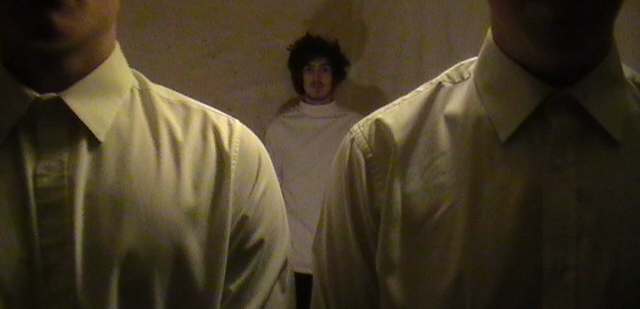
Chosen Actors - Charlie
Our video will include 3 characters, all boys as our video does not have a set narrative we will be using the actors to portray an asylum and doctors. We will carefully pick their clothes and shape their characteristics to fit in perfectly with our theme. The reason for which we have chosen this person is predominantly due to his look and style. The large and messy hairstyle he wears suits the persona of someone being deluded and confused down to a tee. When filming his facial hair style will be prominent in his look also, this is a type of style which will appeal to our target audience we feel. His personality is out going and confident, this gives us more assurance that when it comes to filming he will not be camera shy or nervous when lip sinking. For the other 2 actors their role will be the doctors or security to the deluded character, this is why we will be dressing them in white to portray a pure confusing video. We feel that they are confident enough to be able to cope with the stress of this video and all the different shots. I took on feedback from both of my teachers and we will not be using masks due to the fact that our actors are too aesthetically pleasing to cover their faces. This will work well still and attract the right target audience we are looking for but with their serious faces will also allow the video to be disjuncture.
Lighting - charlie

Thursday 15 November 2012
Peer feedback - digipaks and poster - charlie
Here i have produced a powerpoint with my peer feedback from my poster and digipak. from this i have produced a final digipak and poster with the feedback which i feel i am proud of.


Friday 9 November 2012

Final Digipak

Sunday 4 November 2012
new digipak
Here i have tried to create a new digipak by taking in my peer and teacher comments its a work in progress at the minute and might still need work.

Friday 2 November 2012
our location
here we have created a make do studio out of some lights and sheets, we didn't want a pure white background we were going for more of a dirty white and this comes across good in the video.


Thursday 1 November 2012
Own photographs - charlie
Here are 2 of my own photographs which i would like to interpret into my final digipak, the 1st image didn't have a clear enough image and just didn't look professional so i added some effects and thought it would really make a nice stretched 3 panels for the inside of my digipak.
As for the other image of Brage Alpha, i thought the second edited image could go onto my CD cover i really like it and i have used different filters and effects to make them different.


inspirations
whilst searching on the Internet i have found inspiration from a previous media A2 video, this to me represents the same thing we would like to do in our video and i feel its very achievable.
I really like how they have done this and we will do a similar thing but faster and not with t shirts just with movements.
Friday 19 October 2012
Digipak & Poster - Charlie


Here i have taken into consideration our theme 'disjuncture' and incorporated that into my digipak and poster, we are using animal masks in our video so this is why i have used an outline of a zebra head.
The colours are pretty plain and this is because of our colour scheme and too many colours would ruin the disjuncture feel.
Daft Digipack and Poster
Here are images of my completed 1st draft Digipack and Poster. All work done was using Adobe Photoshop 9.0.


Tuesday 16 October 2012
Monday 8 October 2012
Album name - Charlie
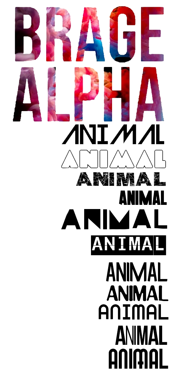
Here i am focusing just on the album name - ANIMAL.
i would like to gather feedback on which style of lettering/font to use as i am very pleased with the BRAGE ALPHA on the cover.
Intrinsic Feedback of Digipak Design
looking back at this design of my last post I would make a change to the text of 'ANIMAL' by changing it to a thinner type face but using the same font still. This could easily be done on photoshop if I was to expand on that design.
Sunday 7 October 2012
CD Cover Idea - Michael

Friday 5 October 2012
CD draft covers - Charlie
Here i have produced a few different CD covers to see what everybody thinks and to see which one would be a good final CD cover.


Thursday 4 October 2012
inspiration for inside pages of digipak
For the inside pages of the digipak I intend to include plenty of images of the star, within these images I will try to acheive a continuation of the 'deluded' mindset of Brage Alpha. One way this could be layed out is shown below.


example CD cover
Here I have found a CD cover of one of Beyonce's albums, this is quite obviously a very different genre and targets very different people to mine. However the use of black and white which creates great clarity and a sense of purity which is a result that I also hope to acheive.
The reason for which I want to create this clear emotion portrayal is so that the audience can get an insight to who Brage Alpha actually is as this is his debut CD.
What I would not make use of from this example however is the graphology in the writing, Beyonce has used a font that shows a regal and glamorous personality, this is a clear contrast to my artist. Instead I would choose a more simple font that does not take away from the message of the image being in a dark place.


plan for digipak - Michael
I am now in the process of planning how my digipak and poster will look for my end product. At this stage my thoughts are of using black and white throughout with the addition of a primary colour, probaly red. I intend to acheive clarity of emotions through facial expression and portray a contextual message of Brage Alpha to represent the feeling of the video. An example of this colour scheme and a CD cover that shows a raw emotional image is U2's War.


Wednesday 3 October 2012
Digipak Analysis

This is Miike Snow's recent CD digipak for his album, as you can see its quite plain and doesn't have masses of colour or anything like that. He has his very iconic rabbit with antlers at his front cover photo and as an image on the CD.
I want to create a digipak that is simple but very affective like this one with images but plain in colours.
Tuesday 2 October 2012
Digipak Draft

This is me playing around on photo shop trying to create a digipak for my artists new album. Obviously its not finished but i wanted to show my progression from the start to finish.
I have gone for the black and white theme to stick with the disjuncture theme of our video and the white more so for purity, the way he thinks hes free and not crazy.
My finished draft digipak will be on soon!
Digipak

I found this template for a 6 panel CD digipak with the measurements. It contains the front part of the digipak and all the inside panels plus the shape in which the cd sits. I plan to use this to create the shape and design for my digipak
Monday 1 October 2012
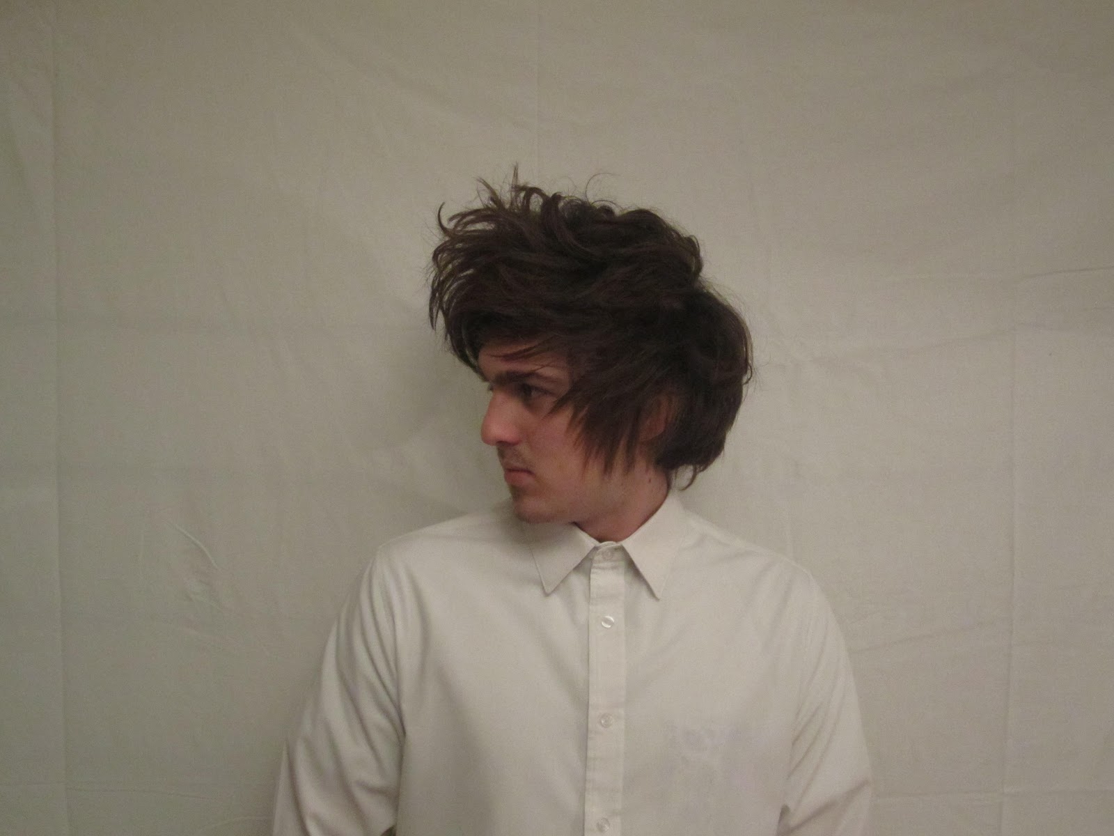
Our Lead Artist
The reason for which we have chosen this person is prodominantly due to his look and style. The large and messy hairstyle he wears suits the persona of someone being delluded and confused down to a tee. When filming his facial hair style will be prominant in his look also, this is a trate of style which will appeal to our target audience we feel.
his personality is out going and confident, this gives us more assurance that when it comes to filming he will not be camera shy or nervous when lip sinking.
 The other two people in the video have been chosen on the basis that again they will be comfortable in front of camera and be able to understand the things required of them in positins and movements.

Friday 28 September 2012
Animatic Story Board
This is the animatic version of our storyboard. Throughout we have tried to cut the video to the beat as we will try to on the final version proper. This storyboard has allowed us to see how our video may look once complete and give us a chance to try different camera angles and stage positions.
Narative Theorists
Laura Mulvey - Male Gaze
we have not created a character/performer which will satisfy the male gaze as our star and backing singers are all men. You could say that we have made a male gaze for the woman, where the main character/performer is attractive to the women and we have done this purposely.
Todorov Theory
"Every narrative starts with an equilibrium (state of normality) Then there's a disruption (a disturbance to the normality) New equilibrium as a result of the disruption."
- In our video, we have begun with a man who is ‘normal’ but then be gets taken into a mental hospital for what he thinks is no reason, but then we realise that he is actually really crazy.
Barthes Theory
"We understand narratives through understanding and decoding signals and codes."
- We will use an actions code to hint to the viewer about what is about to happen. For example we are going to use objects and such to show foreshadowing of later events. We are going to send signals to suggest what is going to happen but not give to much away by hinting a few things. This theory is quite hard with a disjuncture music video.
Risk Assessment
This is our risk assessment for when we are filming our music video, the purpose of carrying out a risk assessment is to enable us to make sure procedures have been put in place to ensure the necessary protection of our team.
Tuesday 25 September 2012
Creating Our White Location
This video displays a way in which a white background can be created, similarly to what we need to have. The budget and euipment shown in the video may be a little higher and professional to what we have access to however from seing this we now have an insight of how we could create one on our resoruces and budget.
For example before we were considering a white sheet background or a white paint on ply wood, but now I would be more inclined to use paper rolls as this is easier to light and has a sharper line to it with no creases.
In terms of lighting between the two of us we believe that we have access to enough light sources but we may wish to additionaly hire or borrow a higher watted and better quality lighting system to create a clean and bold 'zone 1'.
As we have not yet created this white location,it has not been possible to take location shots as yet.
Schedule List
Once we have a final storyboard complted and created an animatic that gives us a clear indication of how the video will look, these are the next things we'll need to complete.
1. find an outlet to hire lighting, camera and tripod from, book when to hire.
2. gather materials to create the white asylum location.
3. hire/buy costume for all three featured males.
4. kit out artists in the video to ensure that the look on the day is slick.
5. film shots of the video sequence
6. post production editing.
(this is a vague idea of sequence events but I have drawn it out to give us an idea of what tasks we have to complete in the near future)
Avery Storm's Version Of Animal
This is an Independent artist called Avery Storm who has, like us produced a new video fo the Miike Snow song. However unlik us he has also changes the lyrical timings and musical tempo using his own voice instead as a cover.
Avery Storm took Miike Snow's lyrics from "Animal" but that is the only parallel with the original. The measurement in Storm's vocal cadence drags with confusion when he sings "I change shapes just to hide in this place." The record attaches to frustrating and discomfiting feelings when life seems like it is no longer in your control. A state of marvel one should attempt to avoid, which is why Avery Storm ran most of the music video.
He like us has taken the metaphorical and implied meanings of the song and converted them into a physical picture that relates to him as we will do when we create the story of the lead being in a trapped mental state.
Wednesday 19 September 2012
Meet Our Artist - Brage Alpha

This is our artist 'Brage Alpha' we feel that he is the right 'look' for our music video and what we are looking for in a person.
We feel that the look he has is good enough to portray an asylum escapist.
He also has a rough look about him which again helps us in the 'crazy' department.

Subscribe to:
Posts (Atom)